Moppi App
Japanese Restaurant App
Moppi is a Japanese restaurant app designed to elevate the dining experience with convenient features.
Client
Google UX Design Professional Certificate
My role
Scope of Work
Interviews, paper and digital wireframing, low and high-fidelity prototyping, usability studies, accessibility, iterating on designs.
Date
June 2024

Project Overview
The problem
Customers often struggle with ordering and picking up food due to language barriers, particularly when waitstaff can't communicate with them. Additionally, those in a rush need a quick and easy pick-up service, while others seek to book a table to work remotely.
The Goal
To design an app that allows users to check the menu, order for delivery or pick up, and have meals brought to their table. The app will also enable customers to skip the line, book tables, and collect bonus points, ensuring a seamless and rewarding dining experience.

User Research
I conducted interviews and created empathy maps to understand users that I’m designing for, their needs and problems. There are 2 user groups that can be identified from interviews.
Interview Goals
Identify user needs and pain points
Gain a deep understanding of user expectations and frustrations when using a restaurant app.
Analyze user behaviors and emotions
Uncover the processes, decision-making, and emotional responses users go through when ordering food.
Determine key satisfaction drivers
Explore the features and experiences that are essential for users to feel fully satisfied with the app.
Understand common challenges
Investigate recurring difficulties users face during the ordering process and how the app can address them.
Group 01
They are a vibrant group of young adults, typically between 20-26 years old, with some being non-native speakers. Their main goal is to find a balance between their studies, work, and leisure time. They seek an affordable place where they can enjoy good food and spend quality time with family and friends.
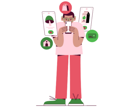
Want to see promotions, categories, favourite folder, calories, nutrients, photos of food.
Some of them needs a menu in different language.
Often pick up coffee and food for the office, so they need an app for easy ordering
Group 02
They are working adults and mostly advanced in their careers. They have family and more responsibilities. Sometimes they want to eat out because it’s difficult for them to find time to get groceries for cooking. They are looking for a restaurant with pick-up service and place to work remotely.
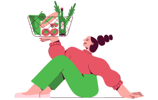
They want to save time on travelling so the restaurant should be nearby.
They want to find information about the level of spiciness of the dish.
Restaurant where they can also work remotely on their computers.
Pain Points
The analysis of user groups confirmed initial assumptions about Moppi customers; however, the research also revealed additional issues, constraints, and challenges that hinder the streamlining of the entire food ordering process.
Financial
Difficulty finding affordable option.
Process
Difficulty adding an item to an online shopping cart. Process is not streamline.
Support
Support not easily accessed.
Product
Difficulty reading small text,
lack of nutrients, allergens, and calorie information,
no categories, “favorites” folder, or food delivery tracking, limited language choices, no recommendations or Discounts.

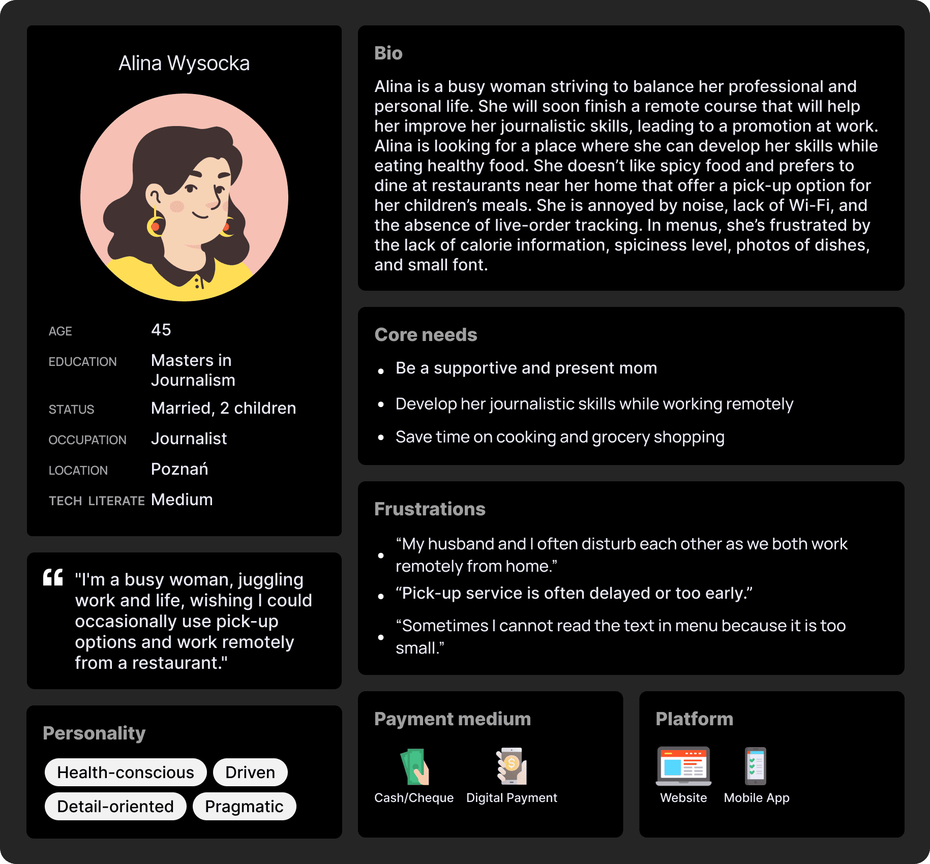
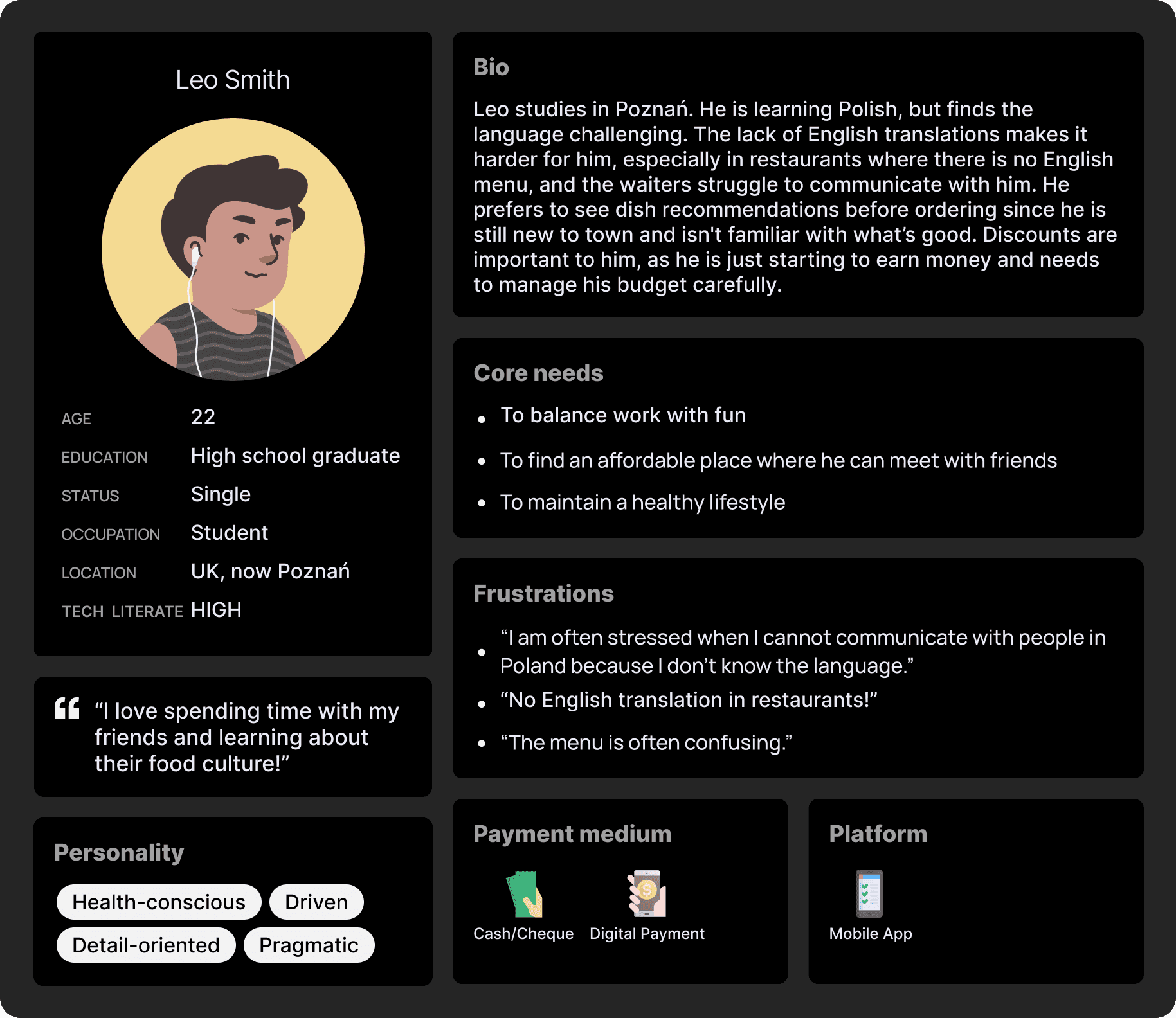
Personas
Based on the user groups identified from interviews, I created two personas that represent the common needs of the users. These personas help in understanding key pain points and goals, allowing for more targeted solutions that align with user expectations.
Problem Statements

Alina
Alina is a working adult who needs an easy app experience to order and pick-up food and also find restaurant where she can work remotely because she wants to save time and develop her skills.

Leo
Leo is a student in Poznań who needs an easy app experience to order food in his native language and navigate the app without language barriers because he doesn’t speak polish and waiters are unable to communicate with him.
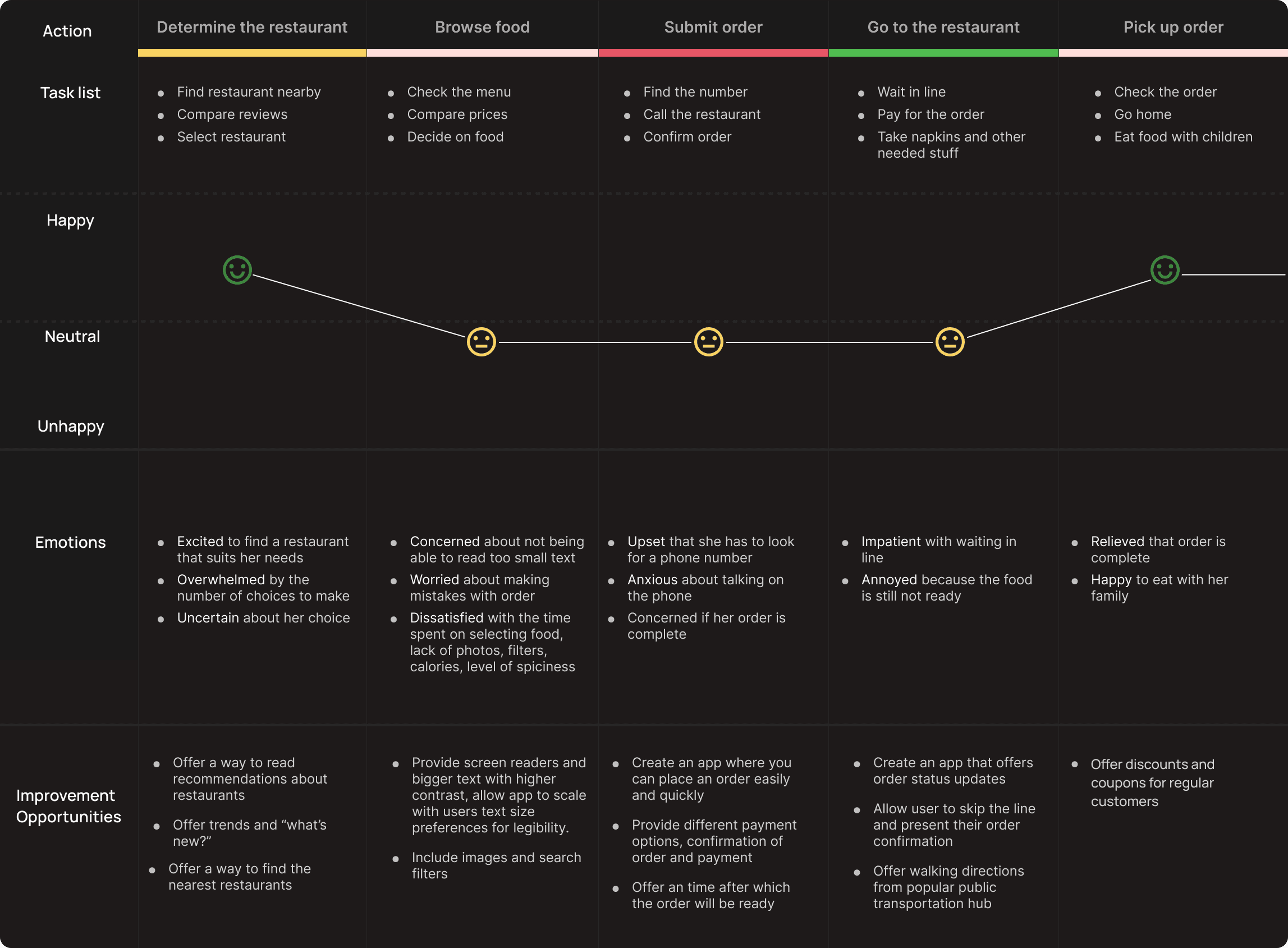
User Journey Map
Mapping Alina’s user journey revealed how helpful it would be for users to have access to a dedicated Restaurant’ app.
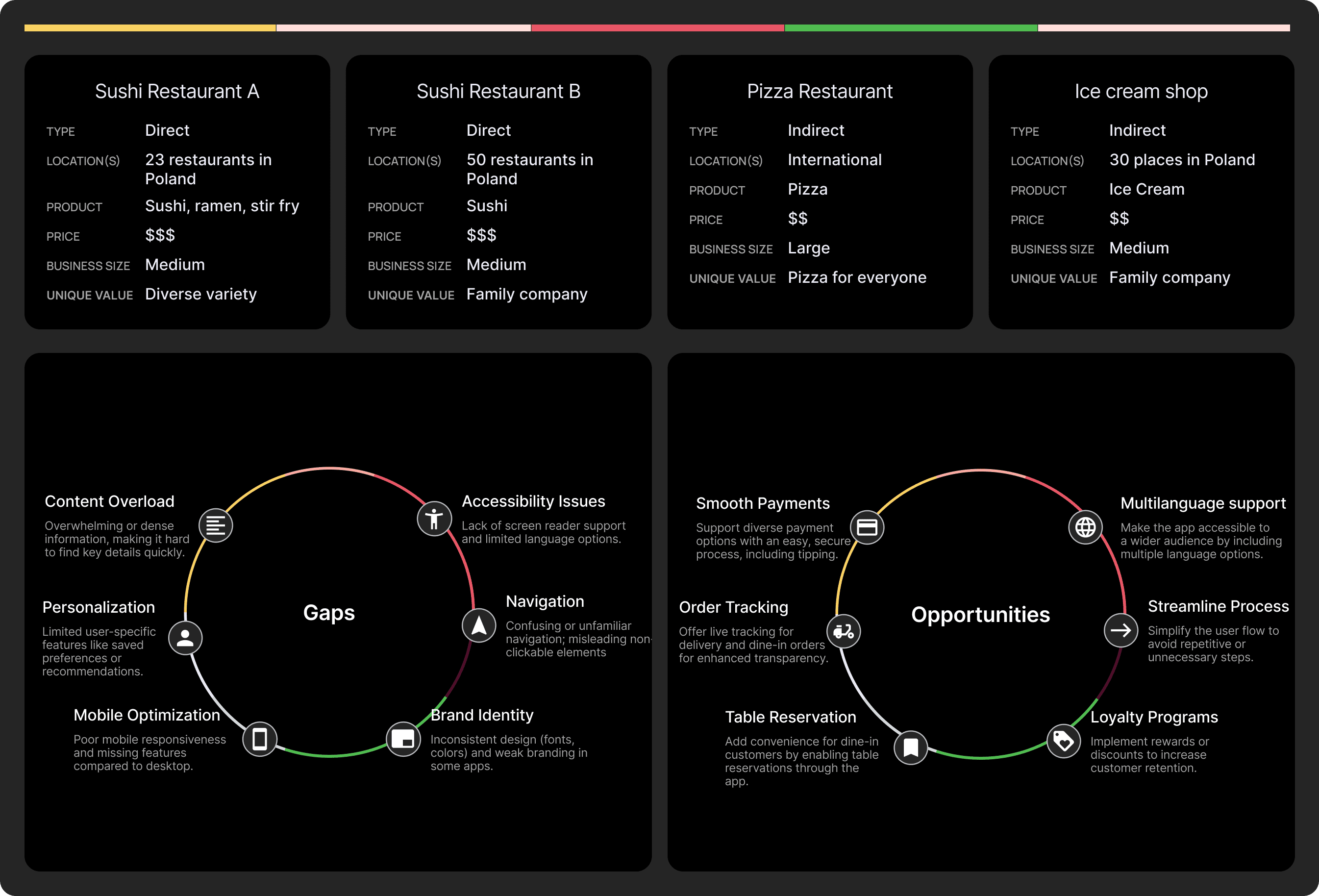
Competitive Audit
To conduct a competitive study, two sushi restaurants, along with one pizza place and one ice cream shop, were selected to compare the information provided and the overall food ordering experience.

Product Values
By synthesizing user research, key insights were identified, forming the foundation for the Moppi app’s core values. These values shaped tailored value propositions, emphasizing accessibility, flexibility, reliability, and professional solutions to meet user needs seamlessly.
Accessibility
Inclusive and user-friendly, with multi-language support, a simple ordering flow, accessibility features like screen reader compatibility, high-contrast mode, and scalable text size for better readability.
Process
Flexibility by providing personalized suggestions, a variety of payment methods, adaptable delivery options, the ability to save favorites, and remembered order preferences for a seamless experience.
Reliability
Reliability with real-time order tracking, detailed nutrient and allergen information, clear food photos, a rating system, and secure order and payment confirmations.
Proffessional
Is reflected in our transparent discounts, real-time chat support, accurate wait times, and a commitment to no hidden fees.
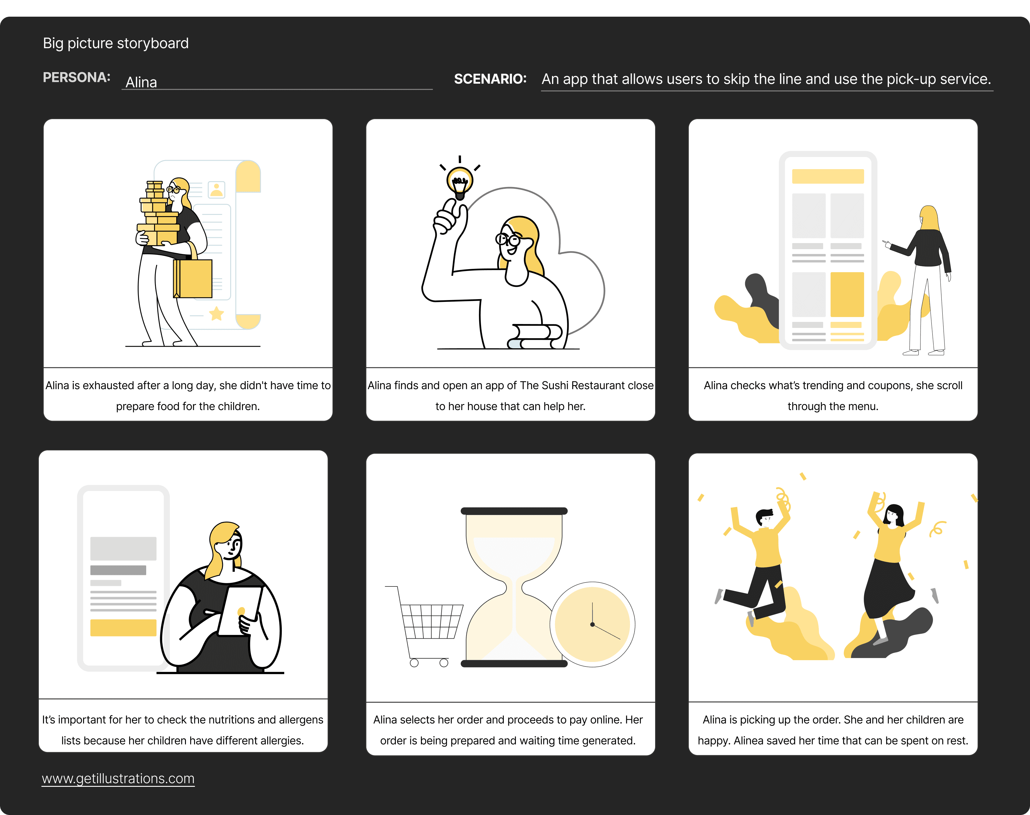
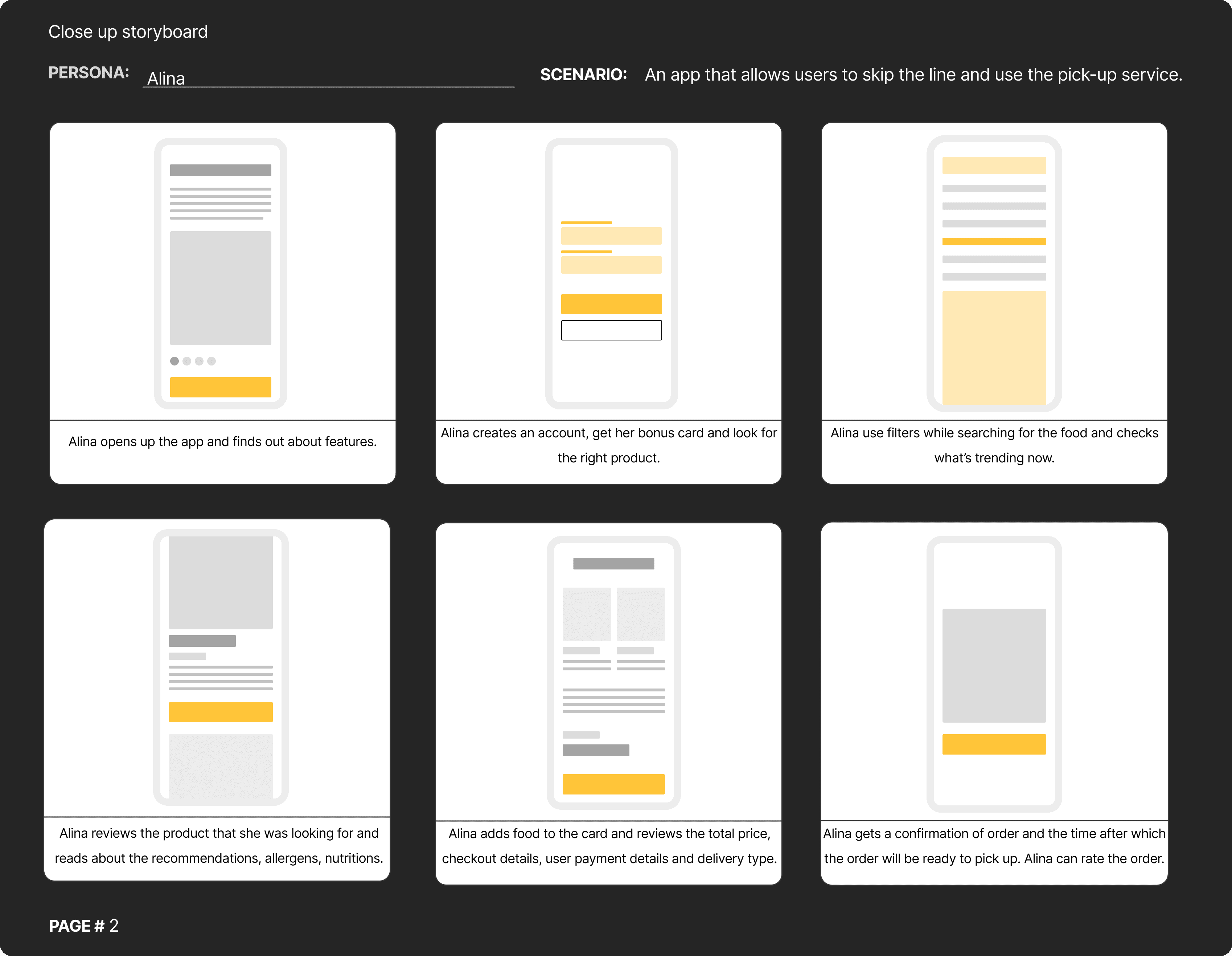
Storyboard scenario
I created two types of storyboards – big picture to map the overall user journey and close-up to focus on key interactions – ensuring a clear and seamless user experience.
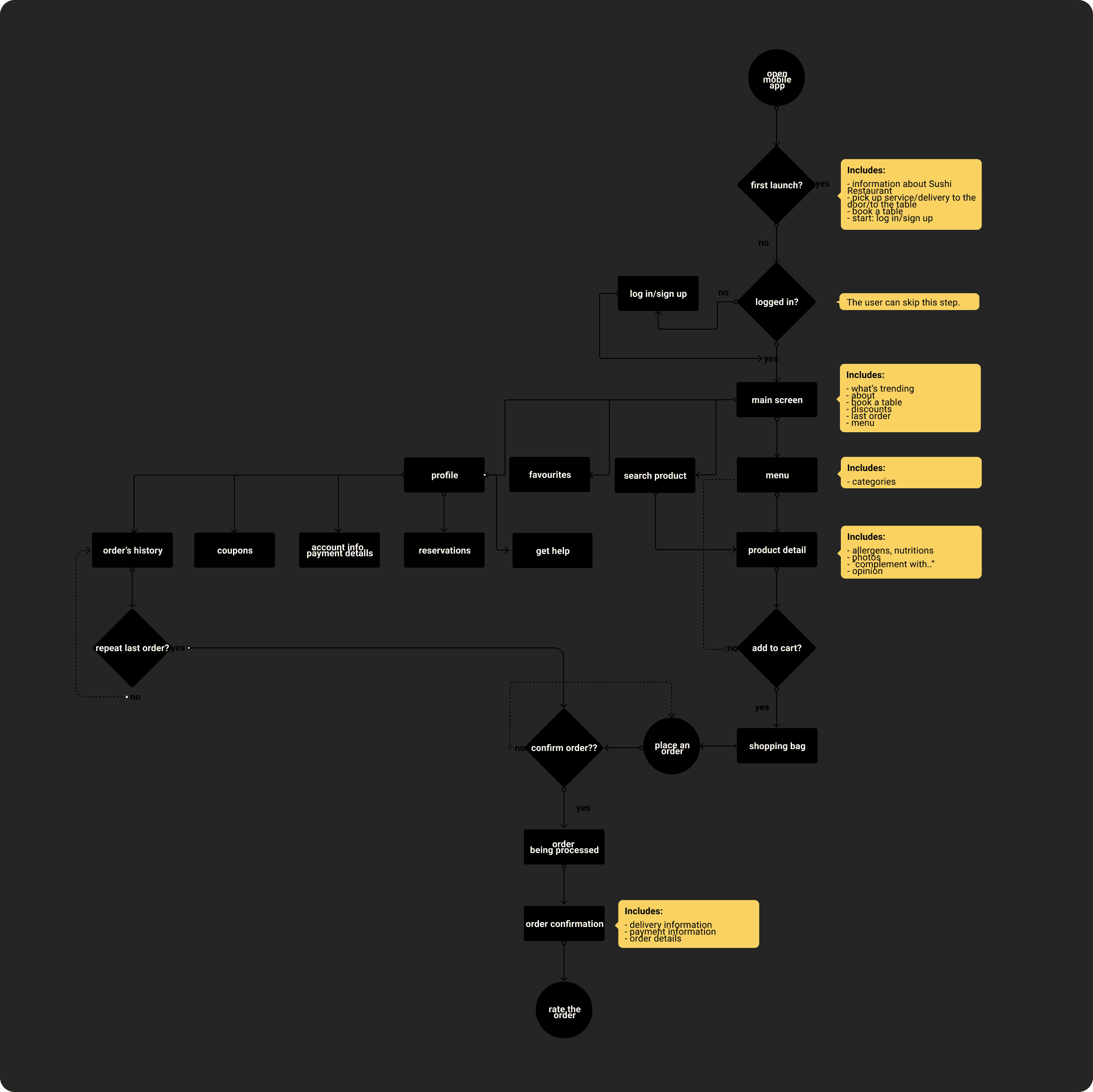
User Flows
I created a user flow to visualize the steps users take, identify potential pain points, and streamline the journey for a smoother, more intuitive experience.
User task: check the menu, order food to the table or use the pick up service, book a table
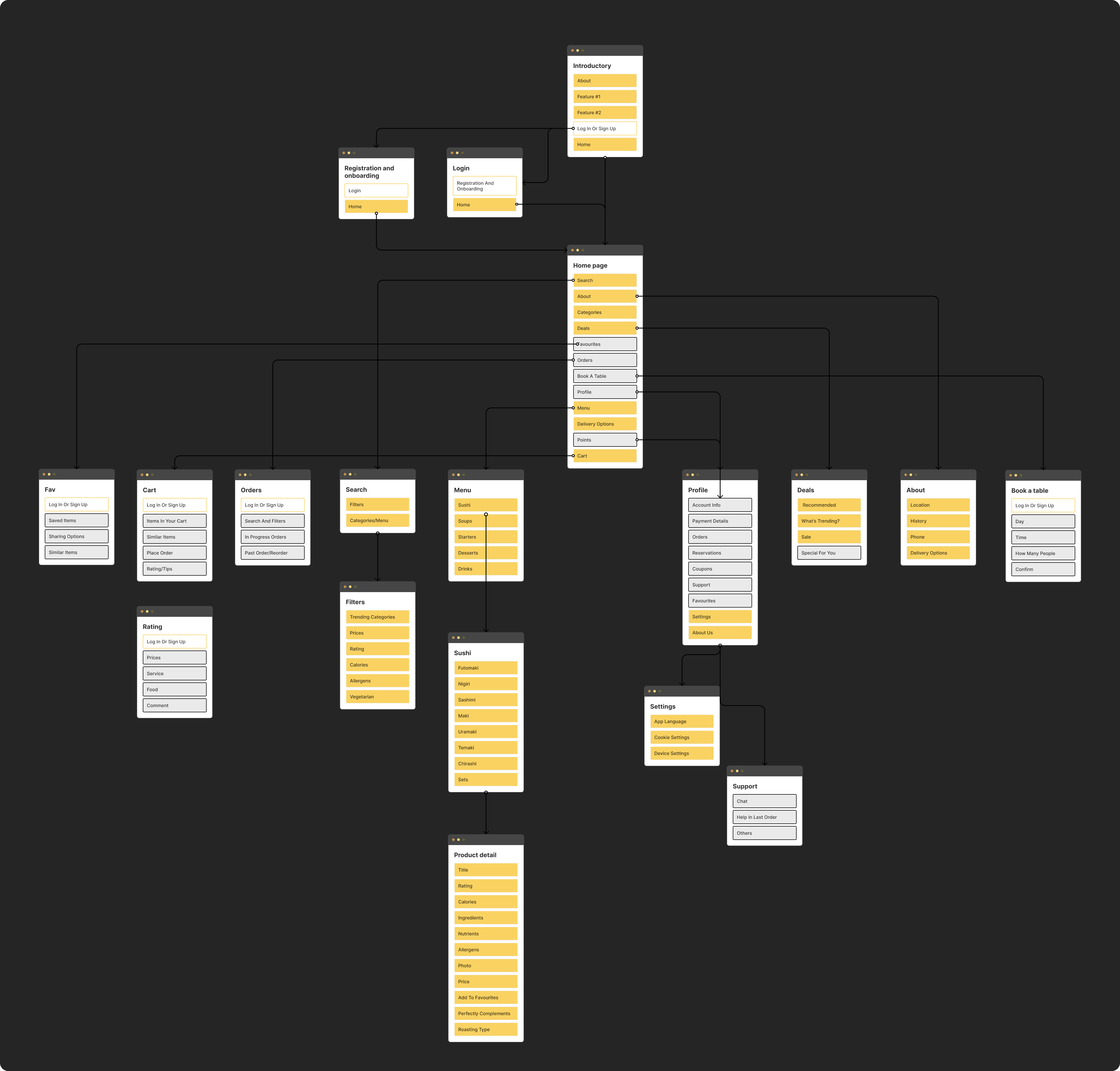
Site Map
I created a site map to organize the structure of the content, ensuring clear navigation and easy access to key information for users.

Wireframes
I created wireframes to outline the structure and functionality of the design, ensuring a clear and user-focused layout. I started with sketches on paper to quickly explore ideas, then refined them digitally in Figma for better precision and collaboration.

Usability Studies
I conducted two comprehensive rounds of usability studies to ensure the design met user needs. The initial study provided valuable insights that shaped the transition from wireframes to detailed mockups. In the second study, I tested a high-fidelity prototype, identifying areas that required further refinement for an optimal user experience.
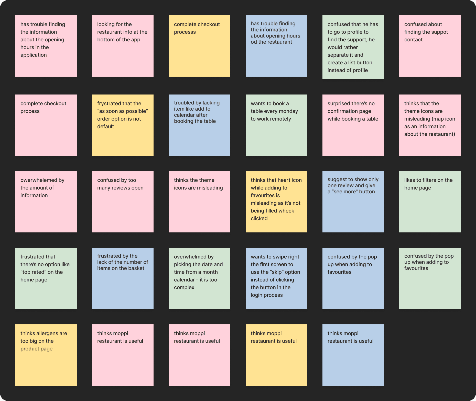
Affinity Diagram
After completing the study, I synthesized the data and categorized it to uncover common themes and generate actionable insights. This process utilized the Affinity Diagram methodology, allowing me to organize observations effectively and prioritize key findings for the design.
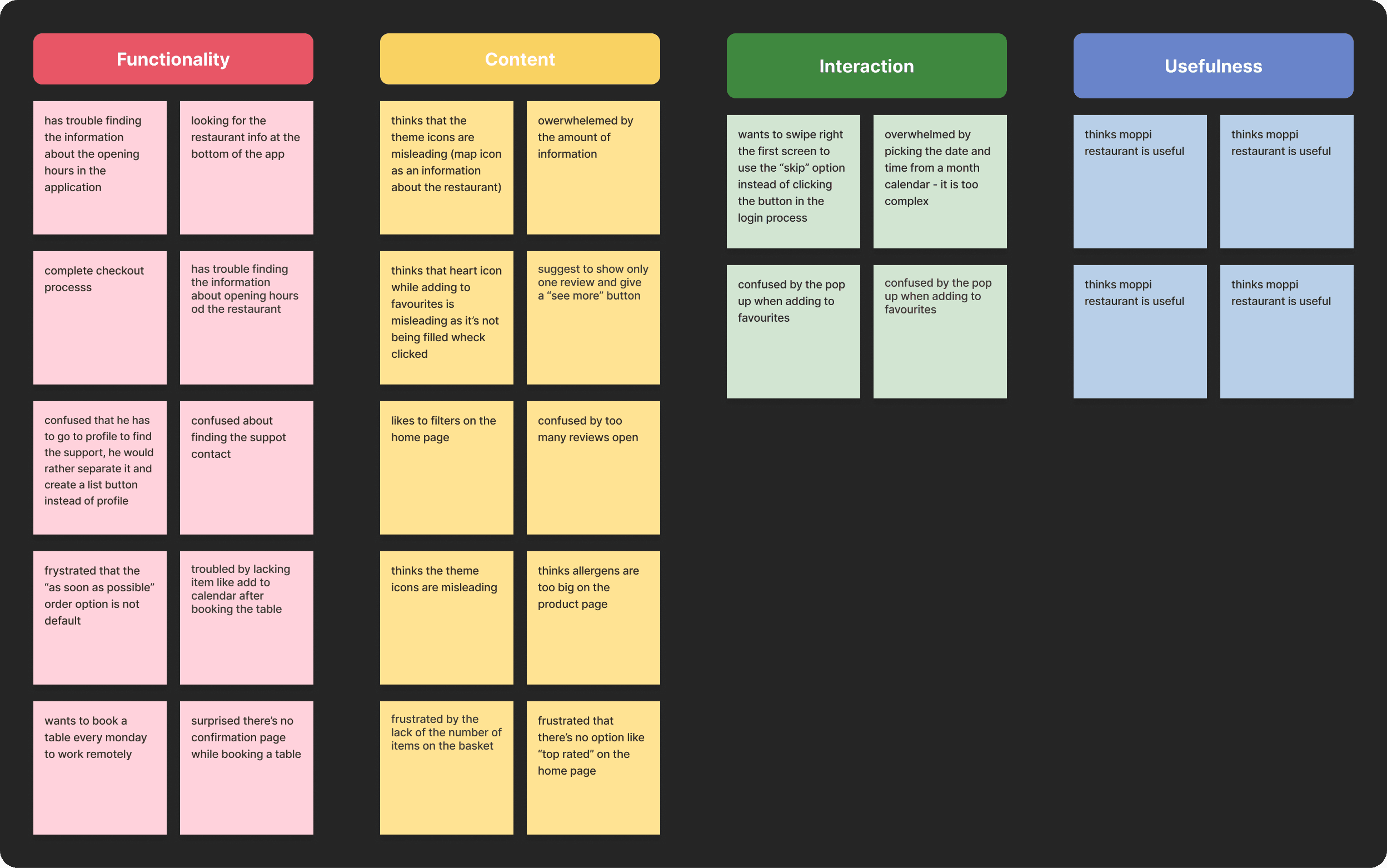
Insights
Improving Visibility and Access to Information
Users need a more intuitive way to find the opening hours information and better cues for what steps are required to contact support.
Introducing Default and Confirmation Options
Users need a default option “as soon as possible” for the order time and a confirmation page after booking a table.
Facilitating Regular Actions and Orders
Users need a repeated action of booking a table (i.e., once a week) and an easier experience while picking the time for the order.
Simplifying Allergen and Review Visibility
Users need to have the allergens and reviews appearance changed as they are overwhelming.
Clarifying and Enhancing Visual Elements
Users need icons that are not misleading for them and want the number of items displayed in the basket.
Minimizing Disruption During Actions
Users don’t want the pop-up notification while adding an item to favorites.
Improving the First-Time Login Flow
Users want to have the option to swipe the screen while logging in to the app for the first time.
Optimizing User Navigation and Preferences
Users need better options and clarity for navigating the app and completing key actions efficiently.

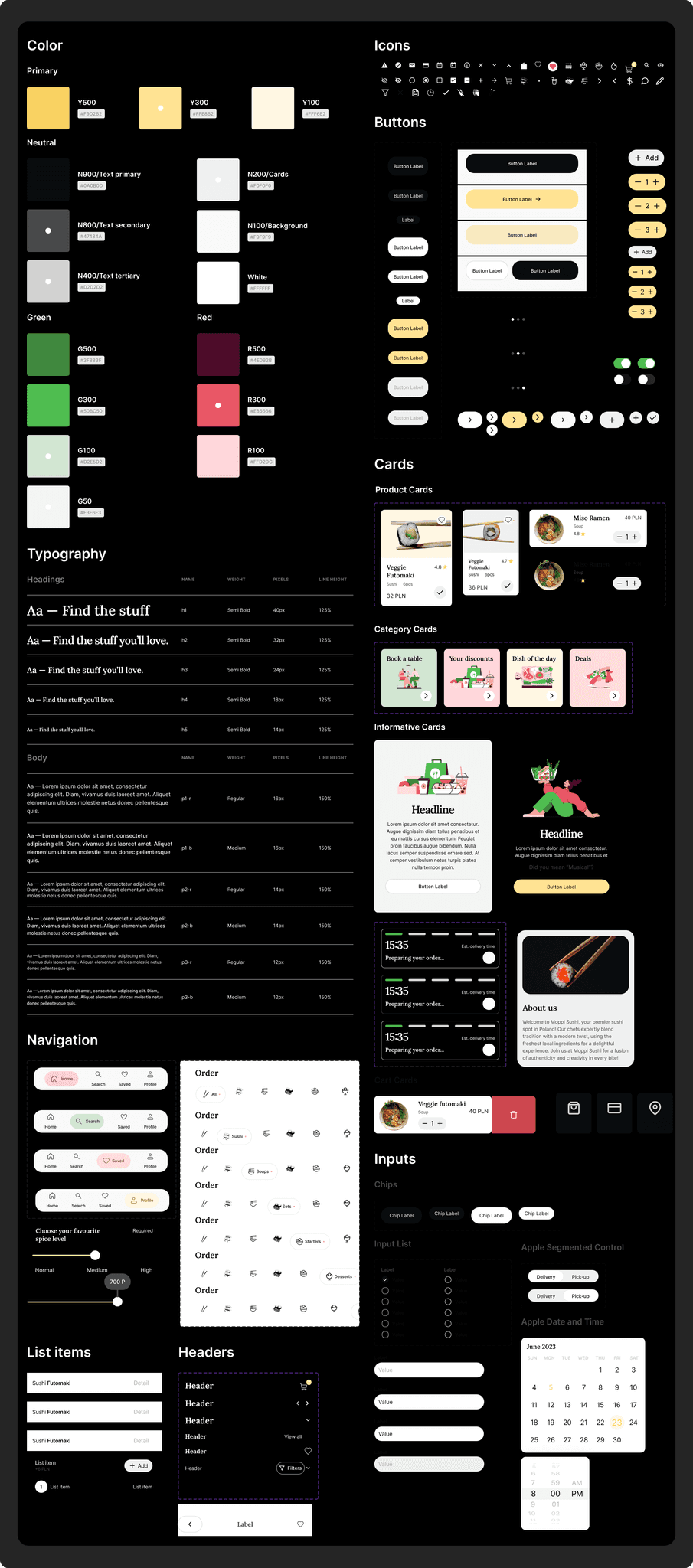
Design System
To build a cohesive and future-proof interface, I created a robust branding and design system for the app. This system serves as a foundation for consistent design decisions, improving workflow efficiency and ensuring a unified user experience. By establishing clear rules and reusable components, the app achieves both visual harmony and functional reliability.
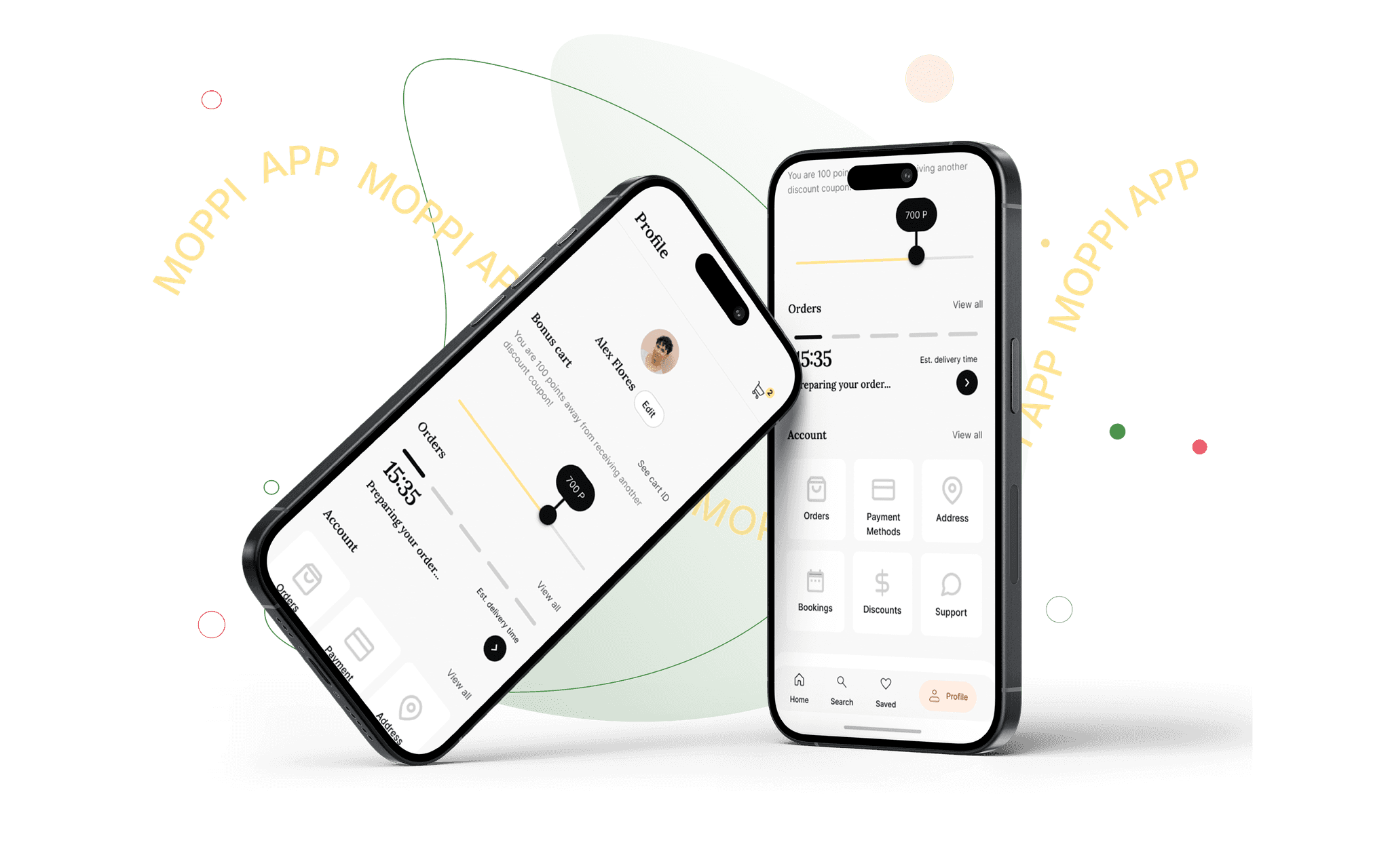
Prototypes
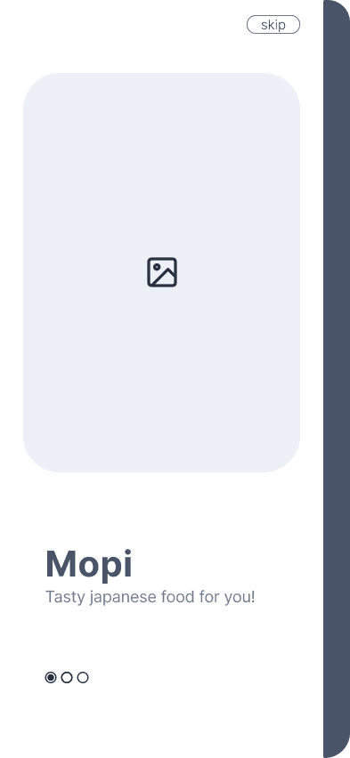
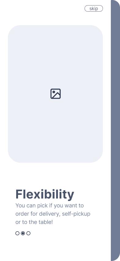
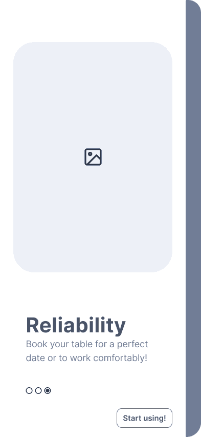
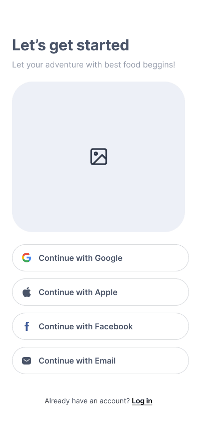
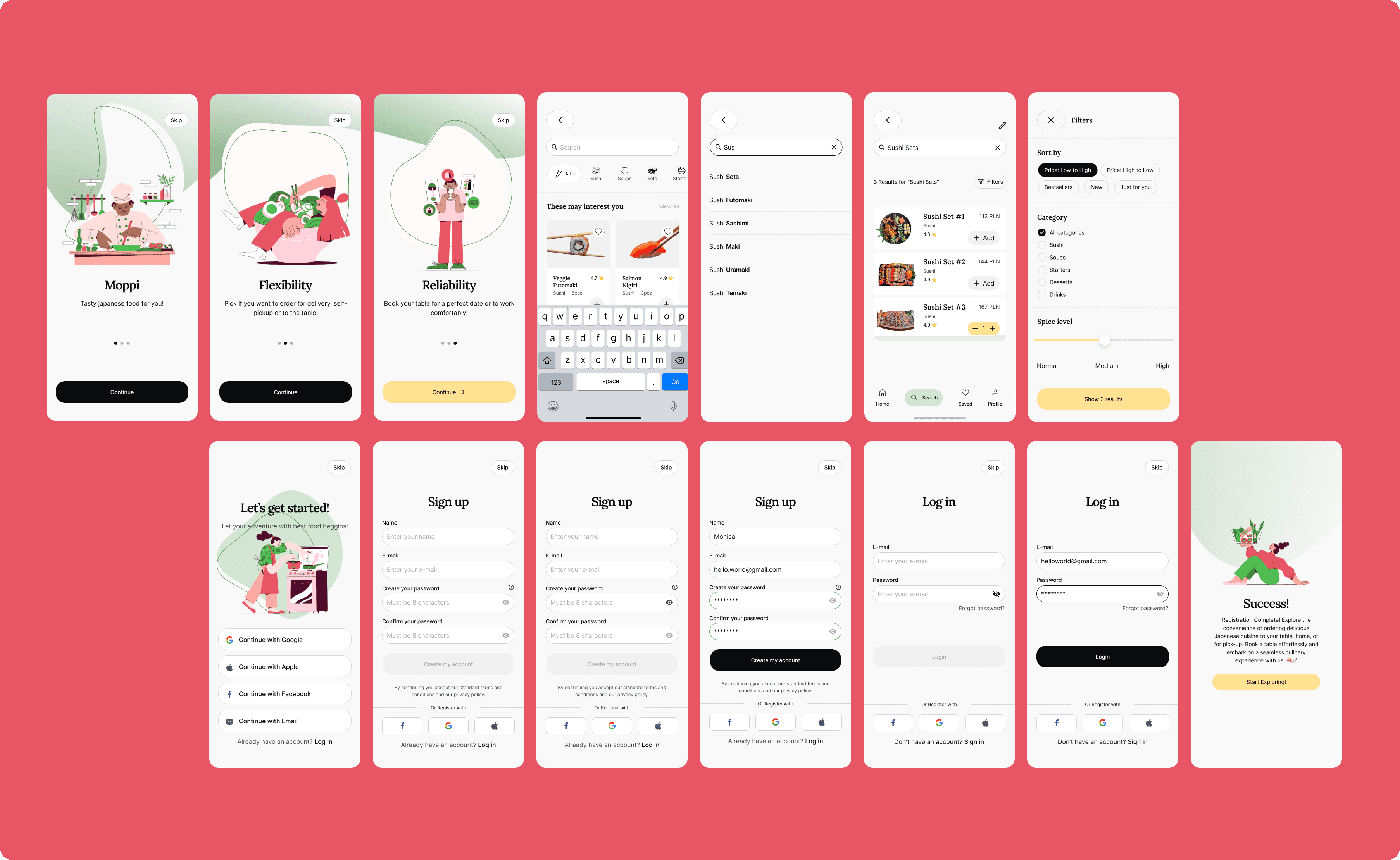
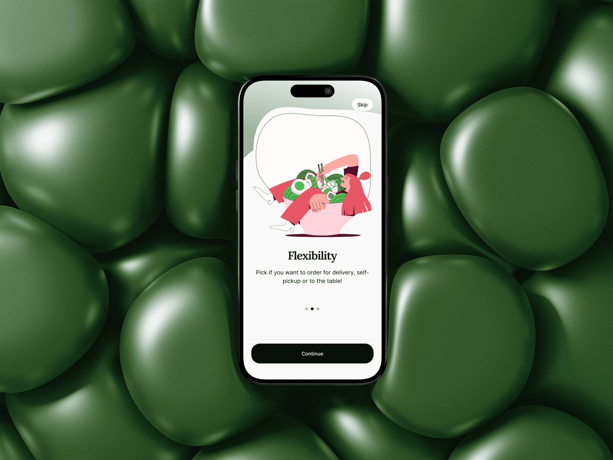
Onboarding Flow
This onboarding flow introduces the app's key benefits—flexibility and reliability—before guiding the user to the login screen for a seamless start.
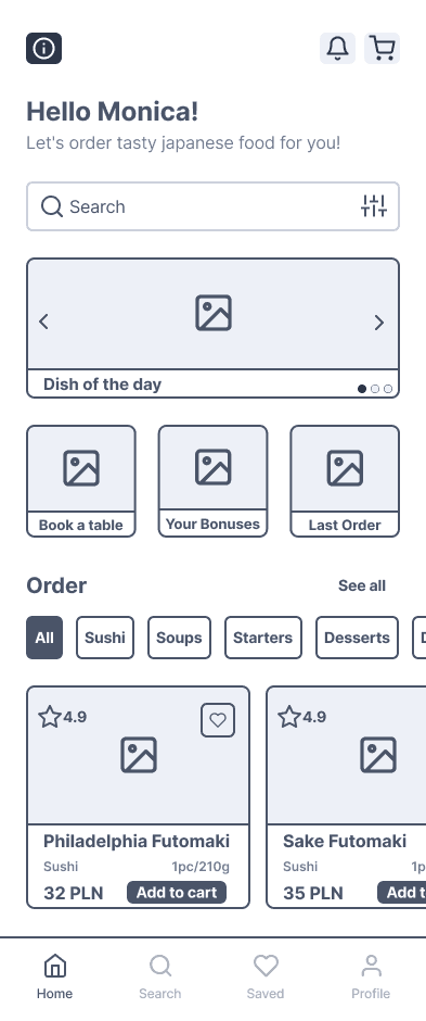
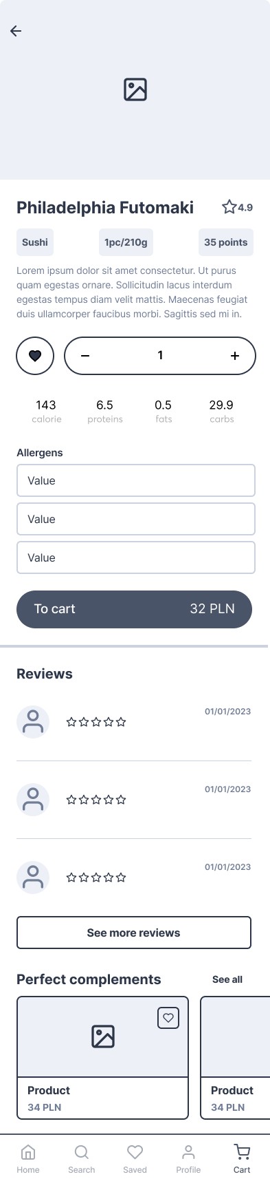
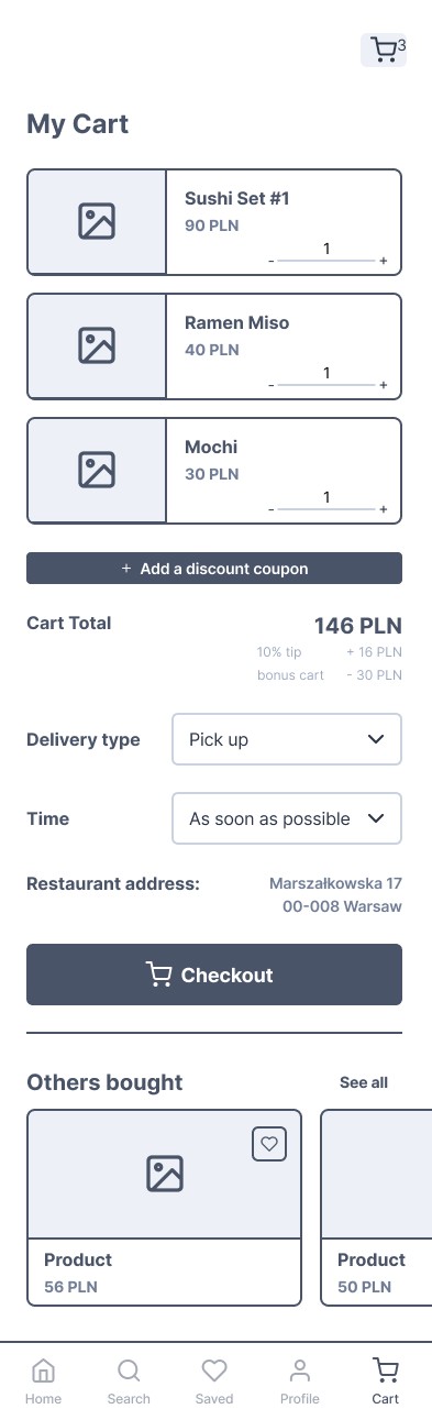
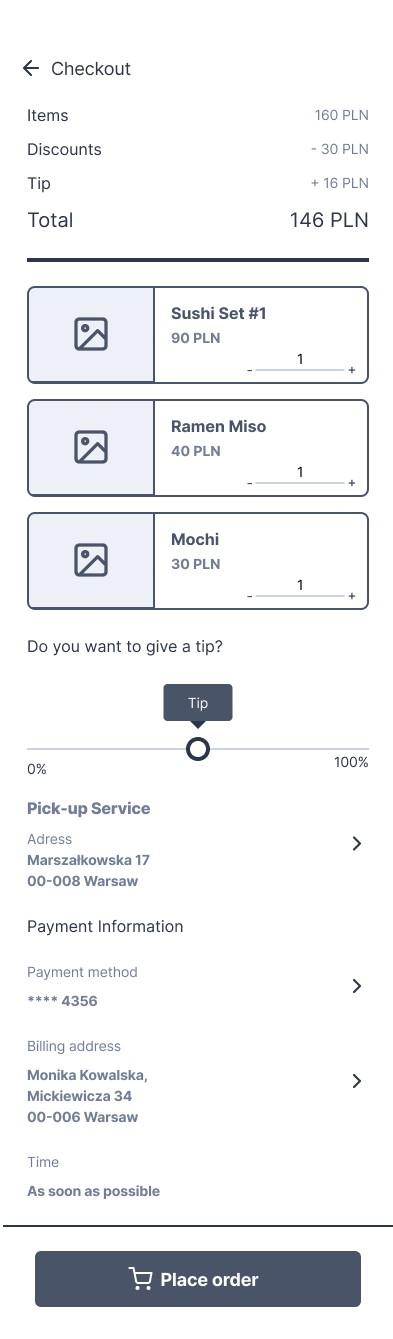
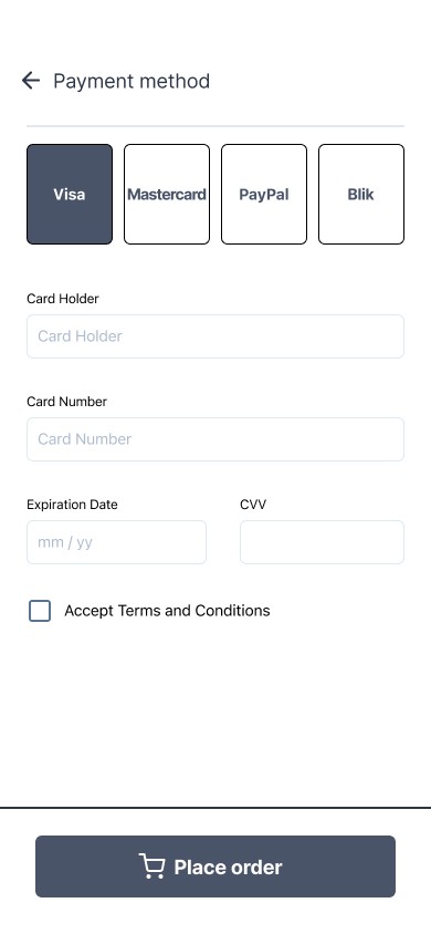
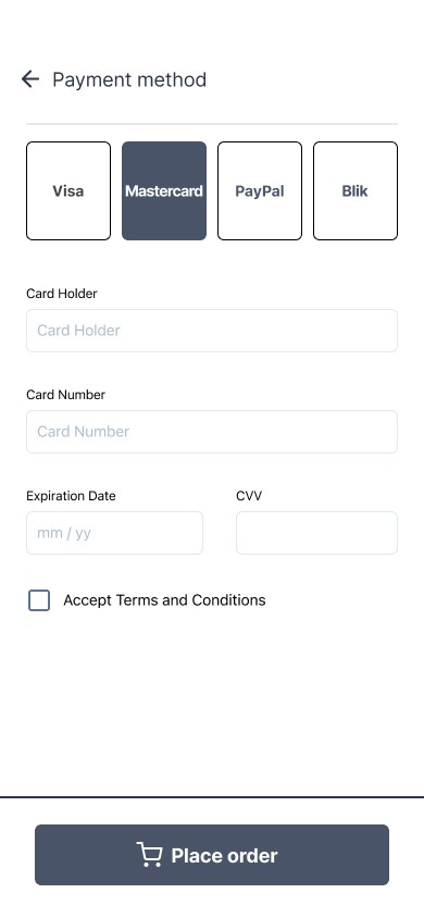
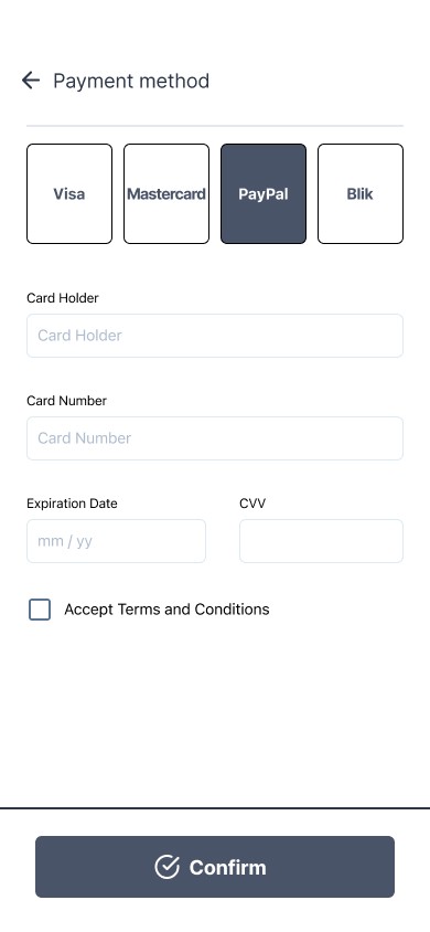
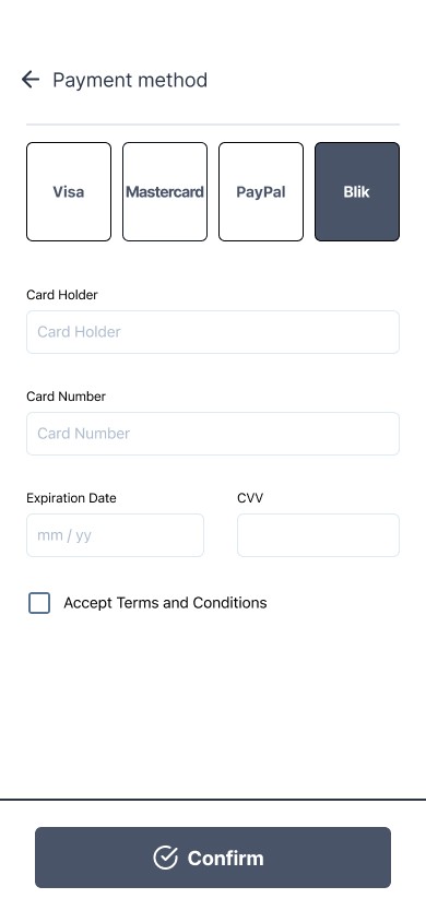
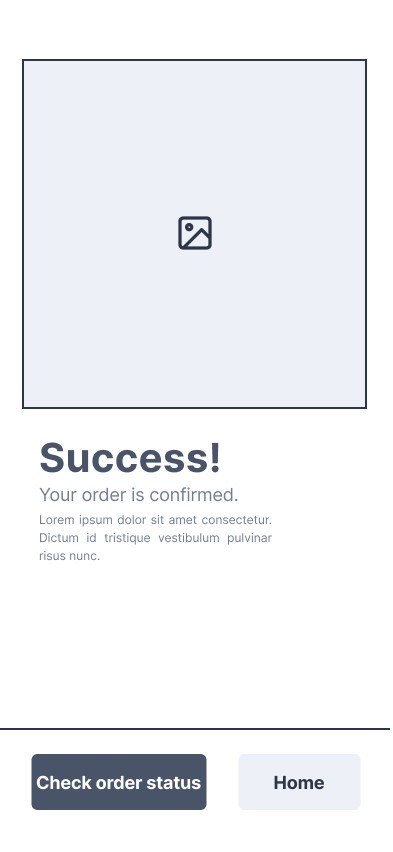
Cart Flow
In this flow, the user adds items to the cart and reviews the dish details, including ingredients and customization options. After finalizing the selection, the user proceeds to payment and receives an order confirmation.
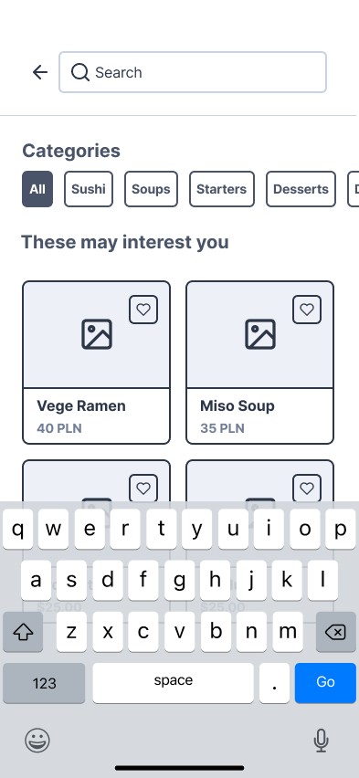
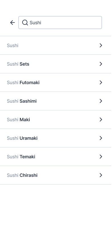
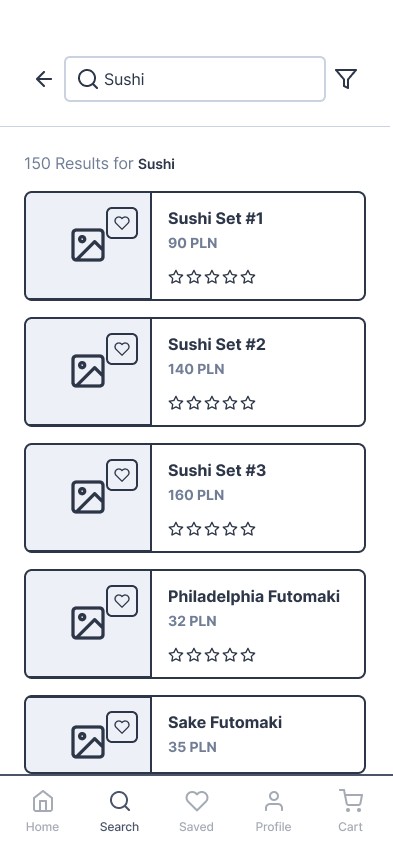
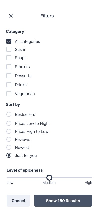
Search Flow
In this flow, the user searches for products and selects the 'Sushi' category. After choosing items, the user adjusts the quantity using +/- sliders and refines the selection with additional filters to tailor the order.
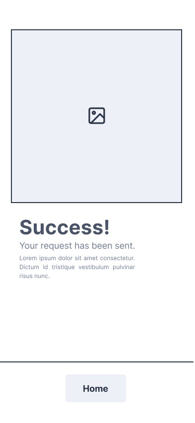
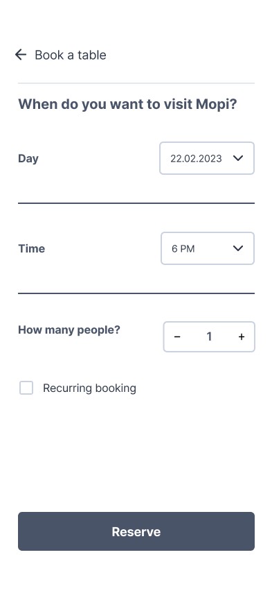
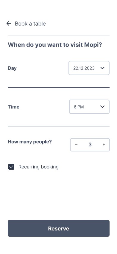
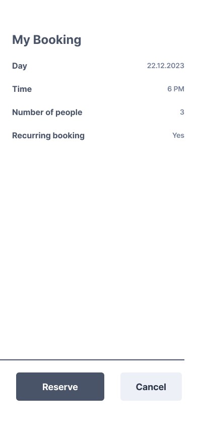
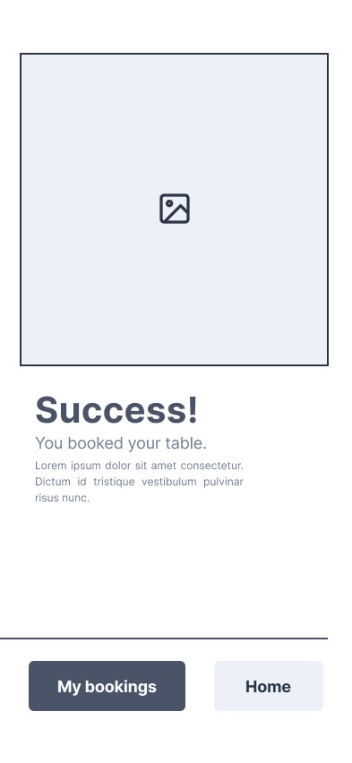
Booking a Table Flow
In this flow, the user selects the date, time, number of guests, and whether the booking should be recurring. After confirming the details, the user receives a booking confirmation.
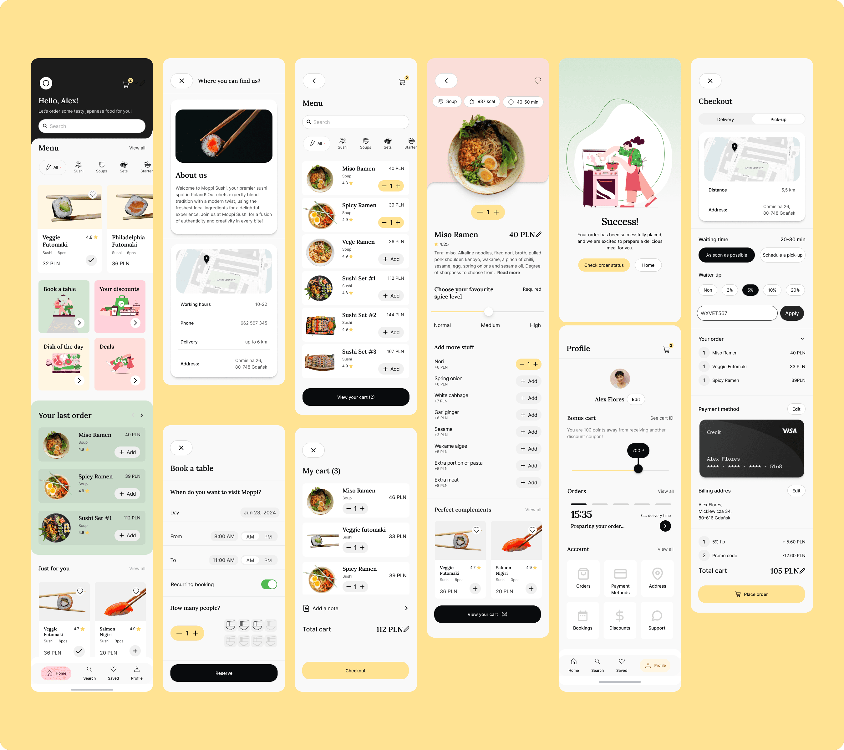
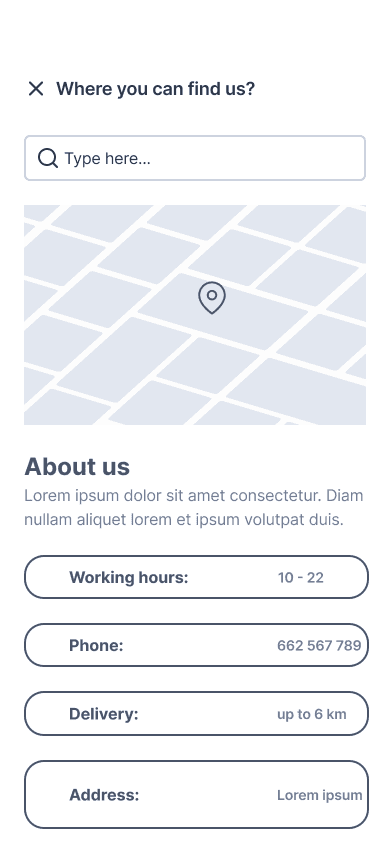
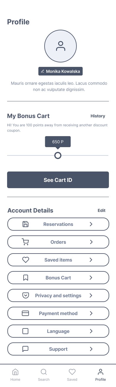
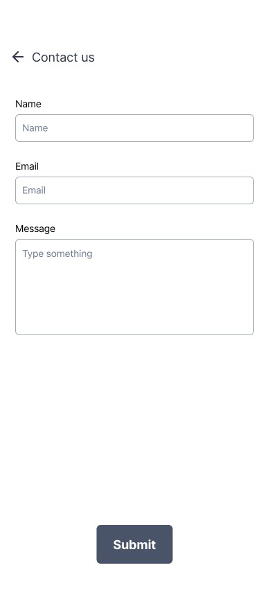
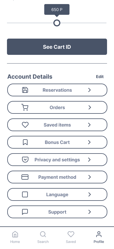
About us & Profile Flow
In this flow, the user accesses the 'Info' section to find detailed information about the restaurant.
Overall, the Ziggo app has successfully enhanced TravelTech Innovations' product offering, positioning the company as a leader in smart travel technology. The app has received excellent reviews from users, highlighting its reliability, ease of use, and the added security it provides. As a result, TravelTech Innovations has seen increased customer loyalty and a growing user base, solidifying its reputation in the market.